

Now to get the diy headboard in there and start making it pretty! We are off to Halifax for the weekend though so it may have to wait a bit but maybe I'll find some goodies while we are out shopping. It was unanimous for the dresser - bold it is! No white this time, I'm listening to my readers on this one!
Some colors I'm considering are navy blue to coordinate with the headboard. Similar to Jenny's island.

A charcoal grey would be quite beautiful as well.

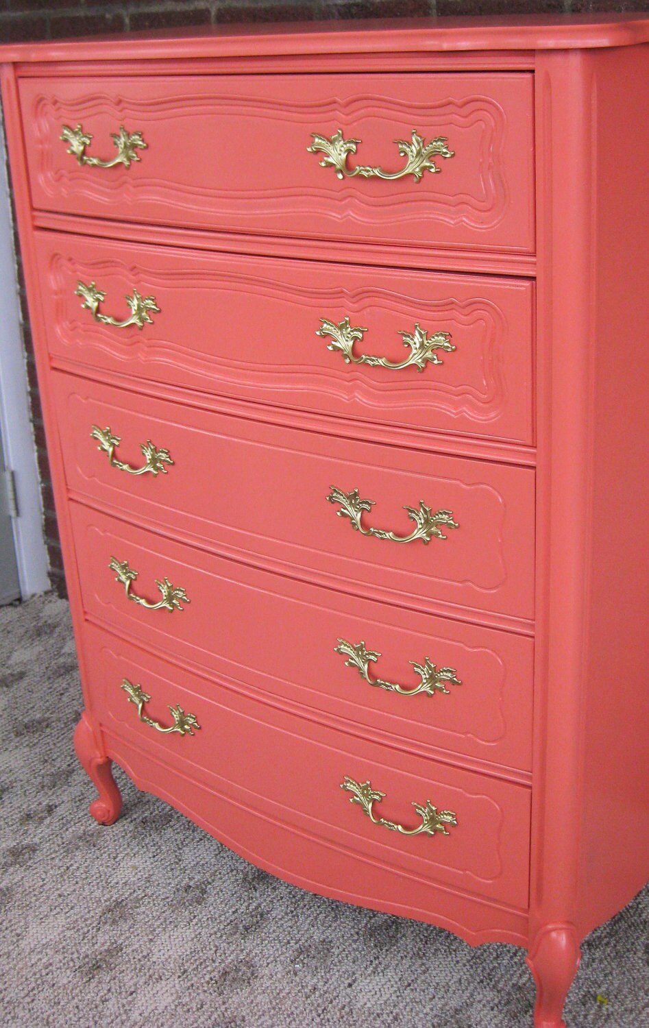
Or maybe I should go really bold and go coral or yellow like these beauties. Nah.. I'm not brave enough.


I also finished stripping the wallpaper in the dining room. What a mess!
.JPG)
Sorry for the boring photos the last few days but it will make the reveal photos all the more interesting, right?
A side note... the PEI styled wedding group that I'm involved in was featured on the front page of the newspaper yesterday! You can check out the article here and read about our Winter Shoot here.


wallpaper removal gives me shivers! congrats on your feature!
ReplyDeleteI'm looking forward to seeing what you do! I painted our bedroom a similar color and it was lighter than I expected too but I love it.
ReplyDeleteI like the idea of the navy. Wallpaper removal is never fun. I dread doing it my powder room, but it needs to come down like yesterday!
ReplyDeleteI love the idea of charcoal but also navy like Carmel suggested. It really depends on what colors you go with in the rest of the room though! Have a fun weekend!
ReplyDeleteI love Jenny's island! I think navy would be good as well. xo
ReplyDeleteChampagne Lifestyle on a Beer Budget
I'm sticking with my navy and brass vote, but charcoal could defintiely look sharp depending on what else you do with the room. Your ex-wallpapered walls look great!
ReplyDeleteI have Para's Cashmere in my home...love it as it is a warm grey... it took me some time to find colour like that a warm and light grey. We have darker floors and a light cream on the trim and any colour goes with it.
ReplyDeleteOh yes....I vote for the navy and brass.
ReplyDeleteThat charcoal dresser has me totally drooling. Beautiful! But I do love the bolder colors too.
ReplyDeleteGlad you're going bold. I just painted a piece bright orange and I was a bit nervous but I absolutely love it now. Go for it girl!
ReplyDelete