We are enjoying it so much that we've almost forgotten what it used to be like. Well almost. The life without a toilet and showering at our parent's houses for weeks is still quite fresh in my mind. If you've forgotten, here's a little reminder.
It was bad. I've had some friends and readers swear that their bathroom is worse and I'll take your word for it. However, we personally like to believe that we held the title of tiniest, ugliest and least functional, all rolled into one little ball of bathroom horror.
So first of all, the footprint. If you recall, the bathtub was to your immediate left as you came into the room with the toilet and pedestal sink adjacent to it. The space was tiny, which meant that when you sat on the toilet, your knees were knocking on the tub. Not ideal. After tearing out the whole bathroom (walls, ceiling and even floor joists!) and discovering it was a possibility, we decided to flip the sink and tub.
This decision meant that we had room for a full vanity instead of a pedestal sink. Thank goodness because we had some serious storage issues. We ended up going with the Ikea Godmorgon/Bravikan combination and hung it floating on the wall instead of using the legs. This makes it super easy to clean underneath and adds to that feeling of spaciousness that we were after. It's amazing how much storage the two full drawers offer, which means no clutter in the bathroom (ie. happy Jane).
In an effort to make the bathroom appear as large as possible, I ordered a custom cut mirror with a polished edge that goes from the counter to the ceiling. Two simple chrome wall sconces flank either side. I love having the flattering light of the sconces compared to the long florescent bulb that used to run along the top of our old mirror. I swear, we got a whole lot better looking with the change!
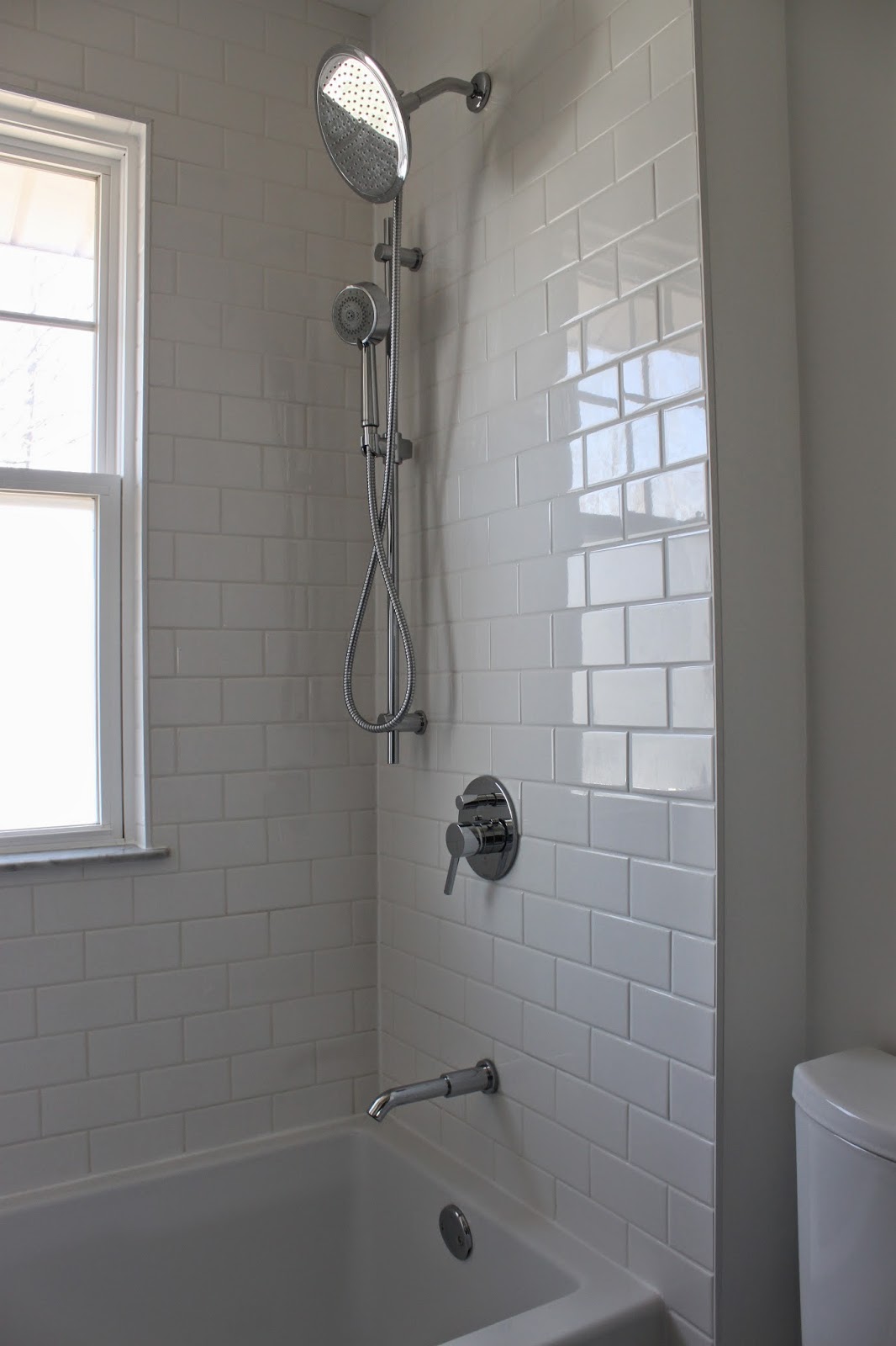
Flipping the sink and bathtub also meant that we now have a window in the shower. We know this is not exactly ideal but it didn't hinder our decision because we knew the footprint change made so much more sense. In fact, everyone who sees the new space assumes we borrowed space from another room. Nope same ole' tiny little bathroom!
Can I just tell you though, how much I love having a window in the shower? I rarely need to turn on the light to shower. We do, however, leave the shower curtain open all the time to let the light flood in and that means there is no hiding a dirty shower. We added a custom cut privacy film to the lower part of the window so the neighbors don't get a little show:)
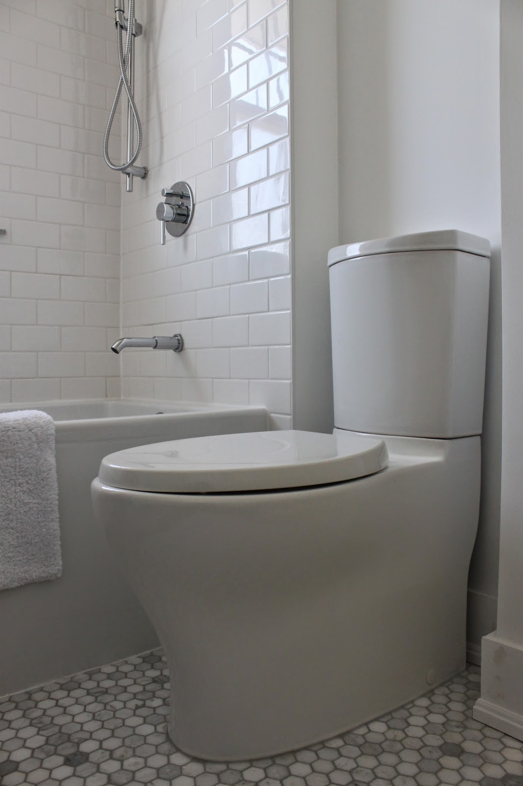
We did most of the work on the bathroom ourselves (that means Steph) but did leave the tiling to a professional. We went with a simple white subway tile with white grout on the walls and a hexagon marble tile with platinum grout on the floor. I think the floor is my favorite thing the room, especially since we put in-floor heat. Such a luxury!
Our tiler put a niche for our shampoo bottles in the wall that is hidden by the shower curtain. This means there are no bottles littering the side of the tub, which can look messy and is a pain with you are soaking in the tub.
He also put two marble sills. One in the niche and one as the window sill. Both are angled slightly to allow water run-off. These were his suggestion and one I am incredibly grateful for. They really tie the floor and wall tiles together.

I chose a relatively simple, low profile shower system and matching sink faucet. The shower system has a rain head and a detachable shower head, with is great for cleaning and rinsing conditioner out of your hair. An absolute necessity that had to be explained to Steph, but he now enjoys.
The toilet was a bit of a splurge but its lean profile fits so perfectly in the space. The pedestal base is a dream to clean, compared to what we once had. Plus, it's a pretty cool looking toilet if you ask me. Worth it.
I hung the custom shower curtain almost to the ceiling and it fall to just an inch from the floor. Once again, the goal was to create the illusion of space. It's actually hard to believe that the ceilings are only standard height. The shower curtain combined with the mirror and the crisp white walls make everything appear much larger and higher than they are.
So there you have it! I, for one, am thrilled with the end result. I mean, seriously, you saw the before, right? Who wouldn't. It was a lot of work though and I learned an awful lot about how disruptive a renovation can be to your home and life. If we were to do it again, I'd do some things differently, regarding the process. Live and learn, I guess. I don't think I would change anything about the finished product.
There is still no overhead light, the curtain rod is a cheapo, the trim and door have yet to be painted, the towel rod and hooks aren't hung and I'd like a shelf over the toilet to put a small vase and an art print. That's quite a list! But right now we are on to other things... Oops:) Always the way!
Sources:
sink and vanity - Ikea
floor and wall tiles - Home Depot
wall sconces - Kent Building Supplies
customized shower curtain - Ikea / Long Liner - Amazon.ca
mirror - City Glass
Hand towel - West Elm
Bath Mat - Target
bathroom accessories (soap dispenser/tray) - Target
Paint - Benjamin Moore Chantilly Lace


Love it!!!
ReplyDeleteI'm in luuurve!!! It looks amazing. I hear ya with that in-floor heating. Such a worthwhile luxury! And I'm amazed that's the exact same floor space as before. I had to scroll up and down to be sure. Super well done job! Enjoy it!!!!!!
ReplyDeleteIt looks so great!! What a beautiful bathroom!! I especially love the window, the tub and the floor tile. Excellent all around.
ReplyDeleteOh and the toilet - splurging on one with a skirt is a must if your toilet isn't hidden between a tub and a vanity IMO. But I'm all fancy like that :-)
It looks so GREAT! What a retreat!
ReplyDeleteSO good!!! Love all the pieces you chose - the tiles are gorg, and that toilet is pretty cool looking haha
ReplyDeleteGorgeous :)
ReplyDeleteBravo!! It looks beautiful!
ReplyDeleteso fresh! i love it!
ReplyDeleteWOW! That is quite a transformation Jane, I keep looking at the old bathroom and then the new....amazing! And I have never seen such a toilet, love it! I have always wondered why the bottom of toilets seem to look like large intestines...really kind of gross when you think about it. Great job guys!
ReplyDeleteAbsolutely stunning. And then you see the horrid before photo and it makes it stunning to the tenth degree. I love the monochromatic in such a small space and the light is just overwhelming!! WOnderfully done.
ReplyDeleteOoooh it looks amazing! Without technically adding space, you added a lot of space! So much more functional.
ReplyDeleteGORGEOUS!! Your finishes are stunning, and that floor was the first thing that caught my eye! Well done! Worth the hassle in the end, to have such a beautiful space!
ReplyDeleteOh man, we put the same subway tiles in our shower and oh how I wish the grout was still cocaine white like that. May I suggest, seal, seal, and seal again. And I read the other day that if you dry the tile after every shower, you'll never have to clean the grout. Worth it, if you ask me. Maybe one of these days I'll bust out a Pinterest DIY grout cleaner. Your floors are amazingly beautiful.
ReplyDeleteI'm picking my jaw up off the floor. What a transformation!! Love the new layout and the details you added. And that toilet is amazing. It has such a luxe look and feel now! Brava!!
ReplyDeleteThank you for sharing
ReplyDeleteI've been looking for, and it can be an idea from here
I hope to be useful also for other people
Once again I would like to say thank you
fungsi vimax ciri vimax original efek samping vimax palsu contoh vimax palsu
It looks amazing!!! Love every inch of it :)
ReplyDeleteLooks phenomenal!!
ReplyDeleteGreat job Jane! It looks amazing!
ReplyDeleteLove it, Jane! Gorgeous and so clean-looking. Glad the shower curtain worked out for ya--it looks awesome:)
ReplyDeleteThis is a smart, gorgeous, and beautiful bathroom. I can't believe the before photos! I was convinced that our master bathroom was the ugliest bath in America, but you may have had us beat. You must be so proud!! I may be stealing your vanity idea for our master bath. I was wanting an all drawer vanity and this one is perfection. Thanks for the inspiration! xx
ReplyDeleteI agree. With the new bathroom look, it’s hard to remember what it was like before. It looks sophisticated and very modern, what with the white tile of the wall, matched with the grey tile of the floor. Sweet! Your parent must be very happy with the result. Now they have a beautiful and functional bathroom!
ReplyDeleteGeorge Bar @ CheapFloors